Editorial design · Page layout
Campaign WPI
Agency profile pages for Campaign's independent-agency showcase, combining photography, short statements and longer editorial content.
View agency profiles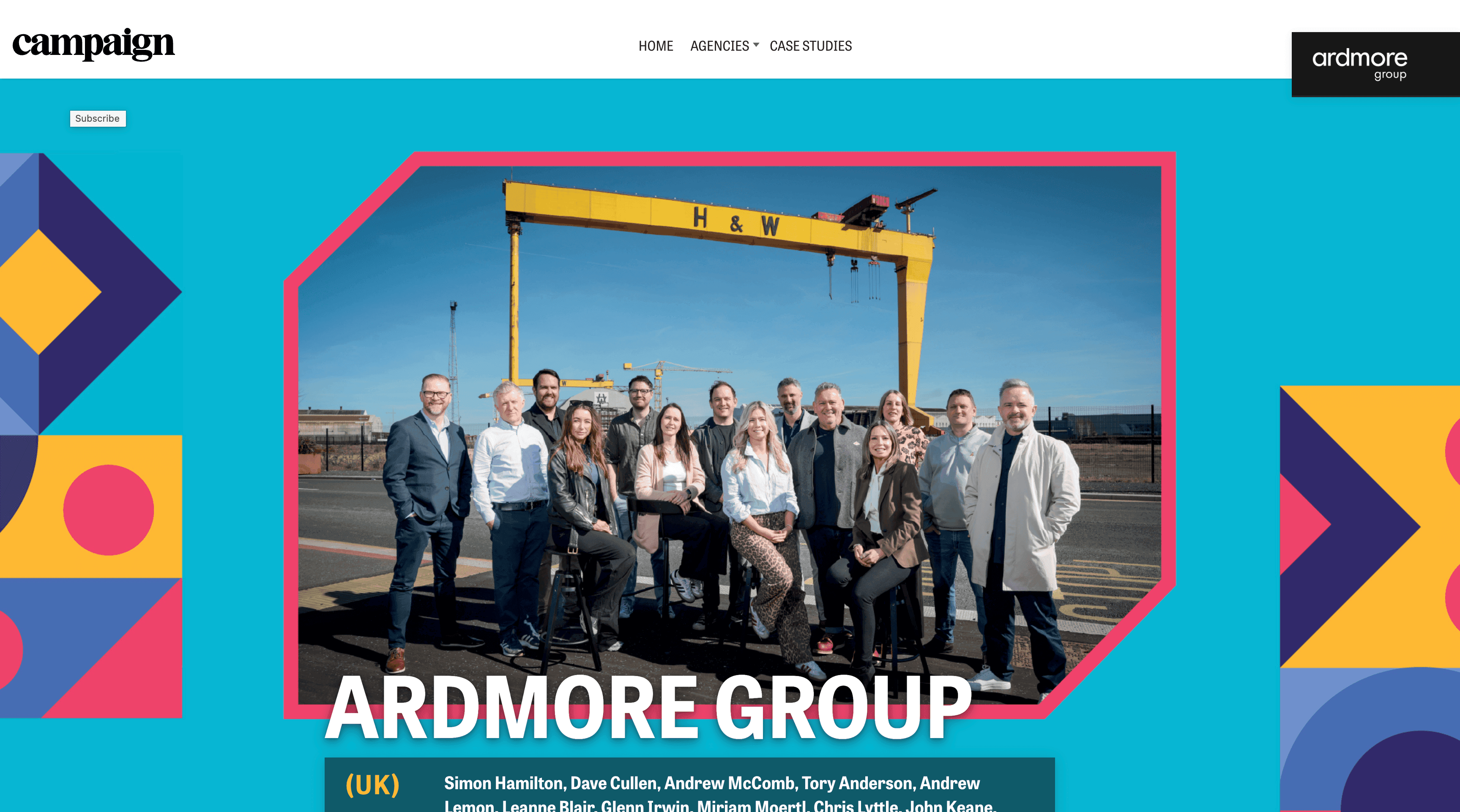
Context
The showcase introduces independent agencies and their work. My contribution was the digital page design: arranging the photography, agency statements and profile copy. The examples here feature Ardmore Group.
The challenge
Each profile needed to introduce an agency quickly, then leave space for a fuller account of its work. Photography, headlines and longer passages needed different treatments, rather than equal space in one continuous column.
What I focused on
Profile structure
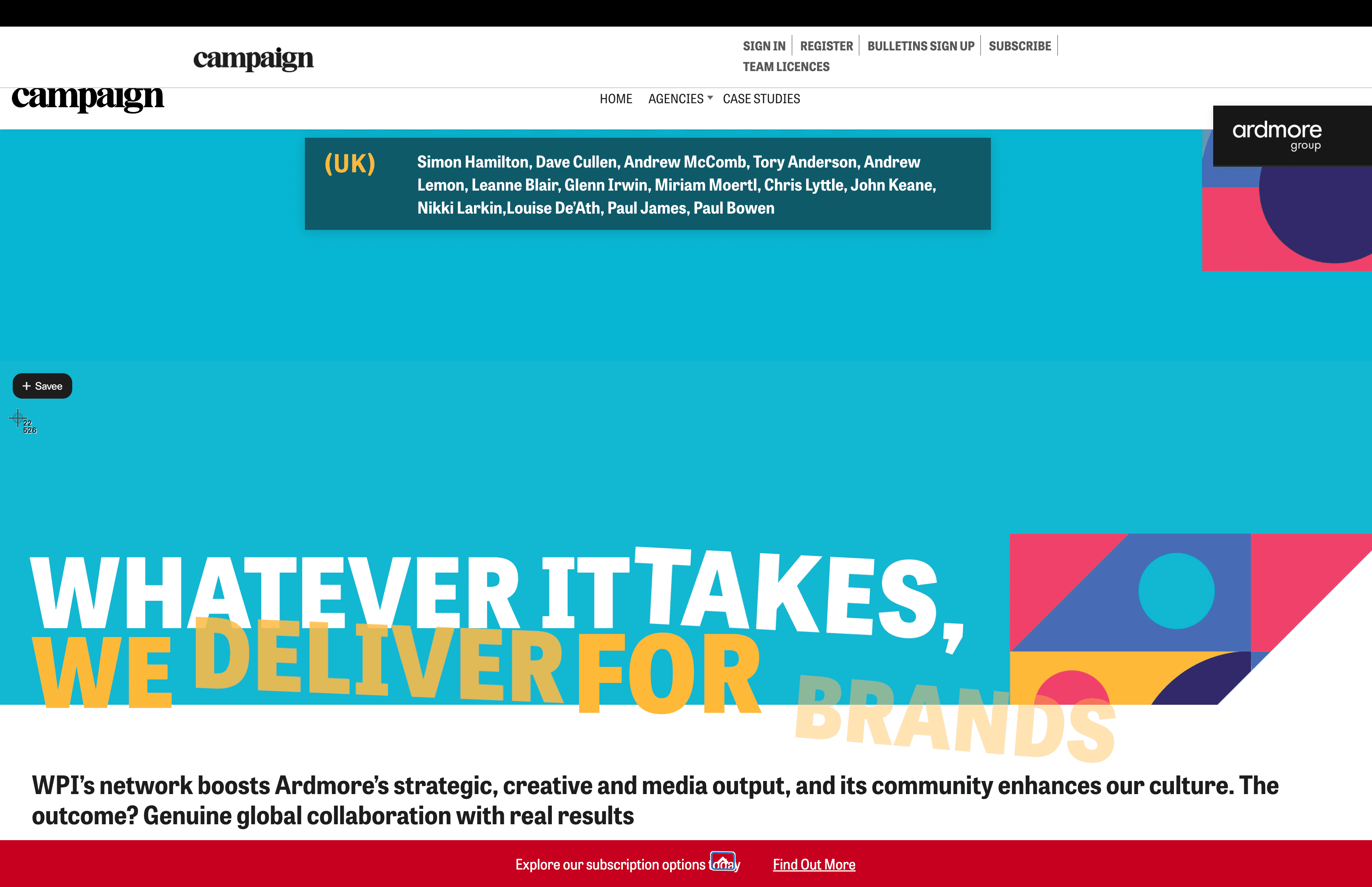
I arranged the page from the agency introduction and key statements through to the longer profile, so readers could get a quick overview before reading in detail.
Photography and short statements
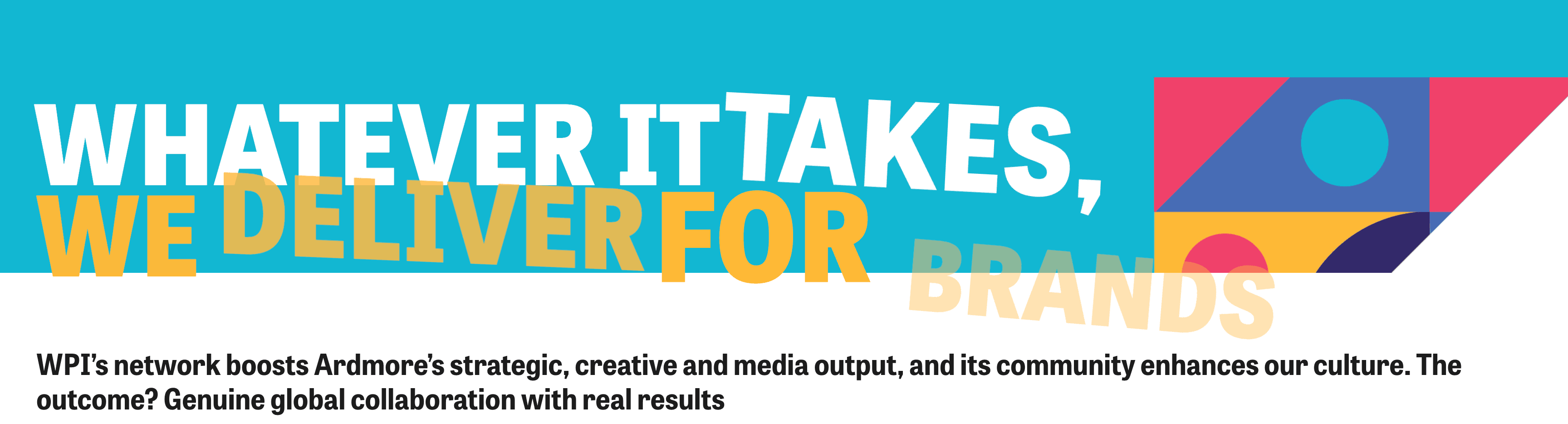
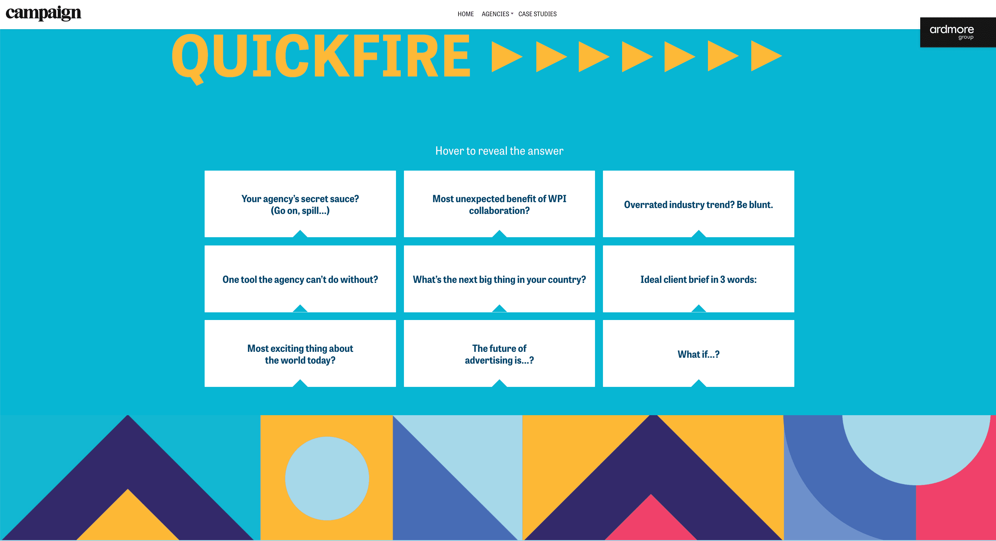
Large images and short statements punctuate the page. Separate card layouts give individual points their own space without adding more paragraphs to the main article.
Readability
I kept the longer copy in a consistent reading column, with headings and spacing that distinguish it from the larger display text elsewhere on the page.
The finished profiles
A profile format that gives agency photography, key statements and longer copy their own space within one page.
Need a digital feature or editorial series?
Get in touch
Tell me what you're working on, what you need help with and when you need it. A short email is a good place to start.
Available for project work, retainers and freelance contracts.